
While every piece within the MET Museum has an important part in art and history, linking one of the 62,856 pieces together because they both contain men really ins't that interesting.
This is just one example of many decisions of what to include (or exclude) in the story above.
First we have to decide what would make an interesting link. We chose:
Then we Linked it all together.

Within these categories we chose to ignore some possible links.
Sometimes there are errors on more commonly, information is missing or unknown about a piece. We therefore also excluded any of the following:
After everything is linked we now need to follow a path from one item to another.
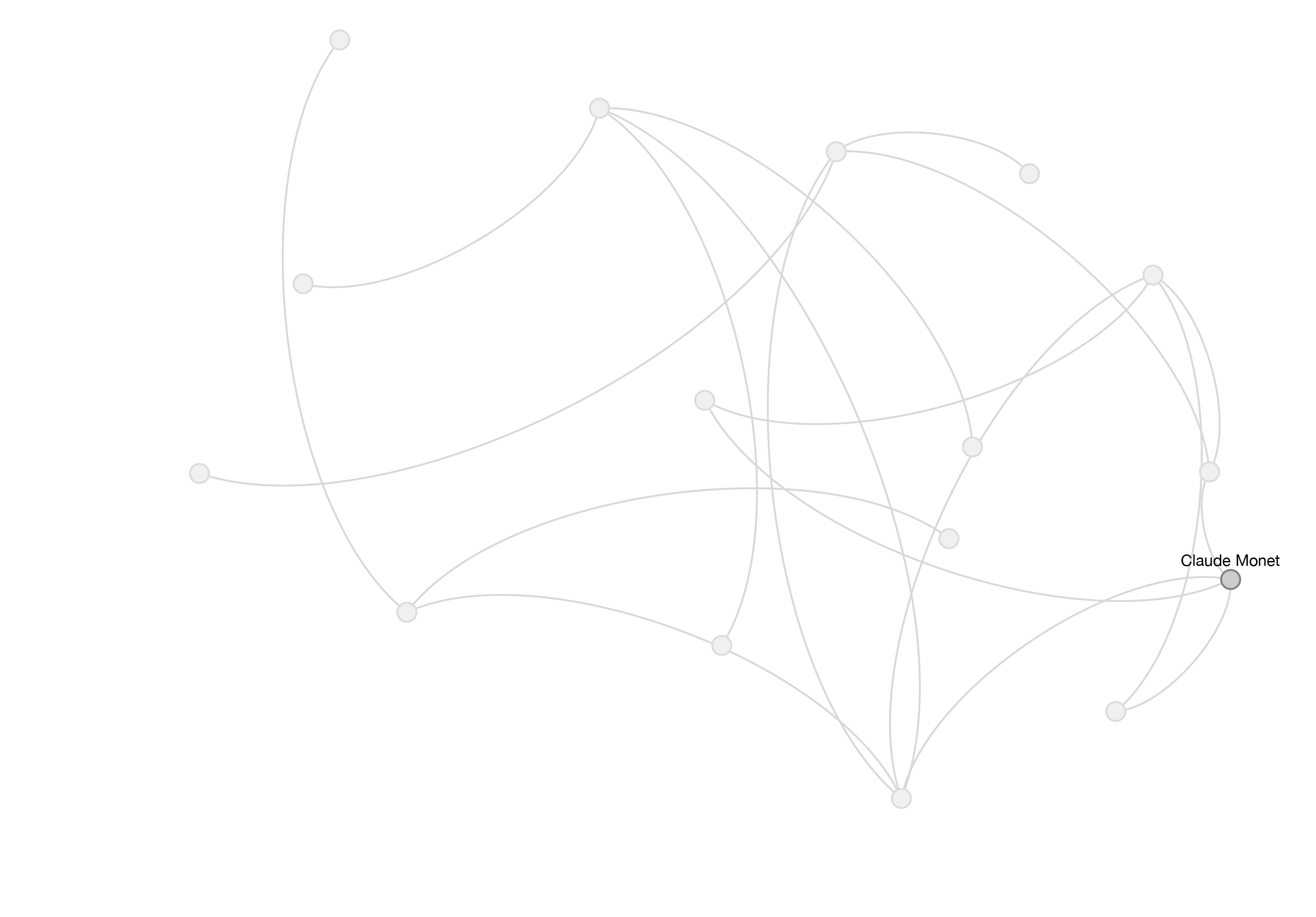
Most artworks will be linked to more than one other artwork, so which one to choose?
We could pick a link randomly, but in reality some links are more interesting than others. The other issue with randomly selecting the link is that most links are realted to dates, which can be interesting but we dont want the whole story to be about dates. We created a ranking system by giving each link a score, with some element of randomness to pick the more interestings links where possible.
Zero Score. We want to avoid (where we can) making similar links within the story, so if the same item has been used before, or it was the same kind of link (for expample from place of birth to place of birth), we give it a zero score.
Finally we have to make sense of all of these dates, places and tags. We need to turn it from data into a beautiful story.
Each set of links is evaluated for their content and over 20 different connecting sentences are created.
Artwork
Connector
Date
We arrive at the story. A randomly generated story with countless possiblities linking art through time, geography and content.
Go back to the top